Level 1 · Delegation
Just run the process
For repetitive, predictable tasks: describe the goal in a sentence and the agent chain is assembled, with target, period, and channel auto-detected.
B2B · AI SaaS · Dashboard
NAVER BUSINESS PLATFORM · 2023
Before NAVER’s AI marketing tool moved toward monetization, I designed a performance dashboard for 30K+ enterprise users that helped business owners understand what the product was doing for them, and what they could do next. The work combined customer interviews, information strategy, visualization choices, UI delivery, and post-launch education.
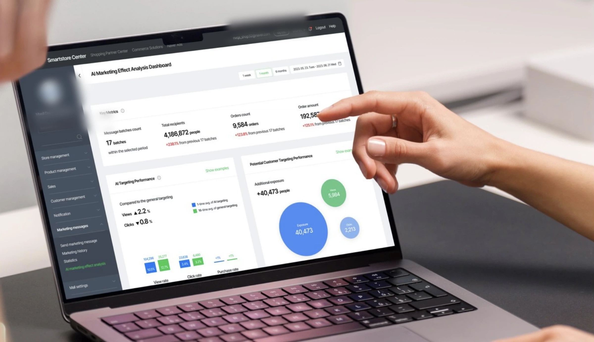
The shipped dashboard in context, key metrics, AI targeting performance, and per-message analysis inside NAVER Smartstore Center. Sensitive values are anonymized.
The CLOVA AI message marketing solution was preparing to move from a free service to a tiered paid model, with two key goals: growing subscribed stores from 30K toward 50K and pushing paid conversion above 50%. Store owners suddenly had a concrete reason to ask what the AI was actually doing for them, and the team needed performance to be legible, not taken on trust.
I framed the dashboard as both a product-utility problem and a value-communication problem: it had to support real marketing decisions while making the impact of the AI feature understandable.
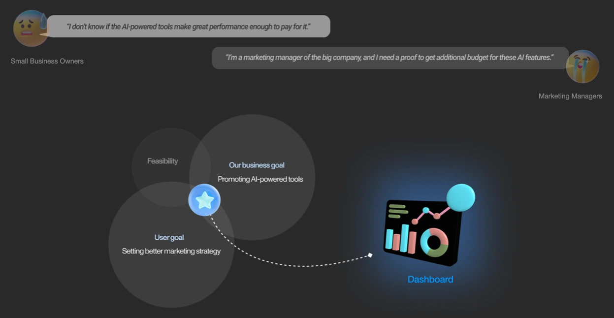
Small business owners and marketing managers both needed evidence: the dashboard sits at the intersection of the user goal (a better marketing strategy), the business goal (promoting AI tools), and feasibility.
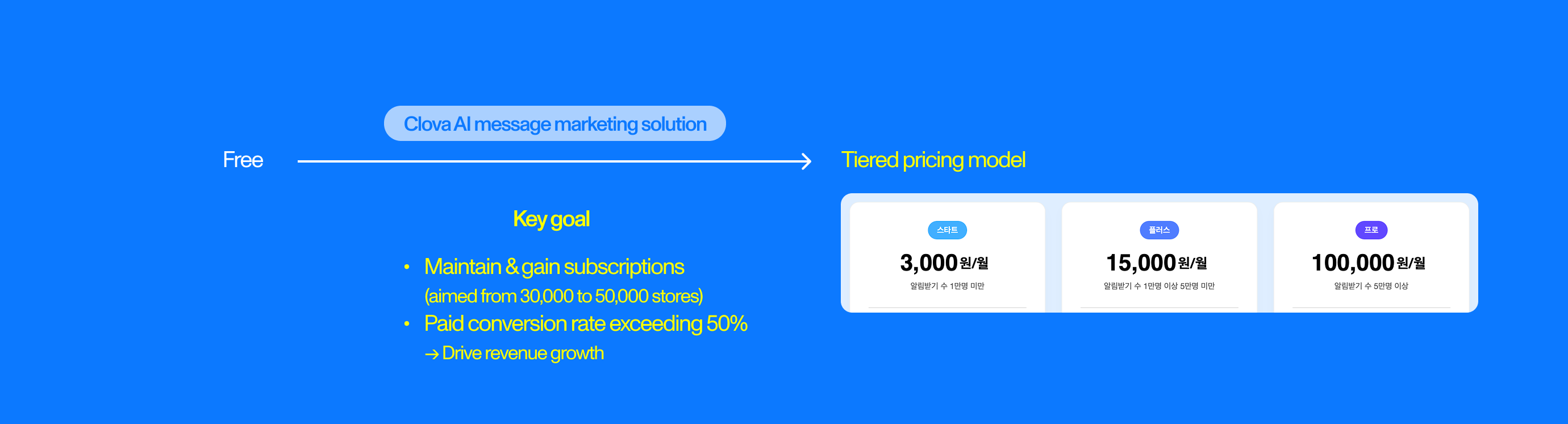
The solution was moving to tiered monthly pricing (Start ₩3,000 · Plus ₩15,000 · Pro ₩100,000 by notification-subscriber count), which made the value question urgent for every subscribed store.
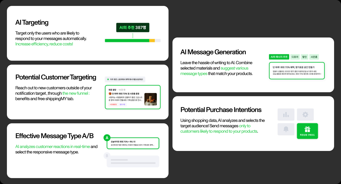
AI Targeting, Potential Customer Targeting, AI Message Generation, and A/B message selection all work in the background, invisible unless their contribution is surfaced.

The solution sits inside NAVER Smartstore Center, the workflow where store owners already run their marketing.
I listed up stores already subscribed to the solution with active, sizable audiences, 10,000+ subscribers with cart items in the last month, or 5,000+ with a purchase history in the last 10 days, and interviewed six store owners for an hour each: three using the AI features effectively, and three paying for message sends while barely touching them.
Performance analysis emerged as a recurring need. That finding gave the dashboard a concrete job: help users understand outcomes and turn those outcomes into more efficient marketing choices.
How might we show the impact of the AI marketing tools, so SMBs can build more efficient strategies?
Three owners with 47–97% AI targeting usage, and three spending up to $7,700 a month on paid messages with 0% AI usage.
Interview notes and clustered themes made the need for performance analysis visible across both highly engaged and less-engaged users.
The dashboard had to be useful enough to support decisions and clear enough to communicate why the paid feature mattered.
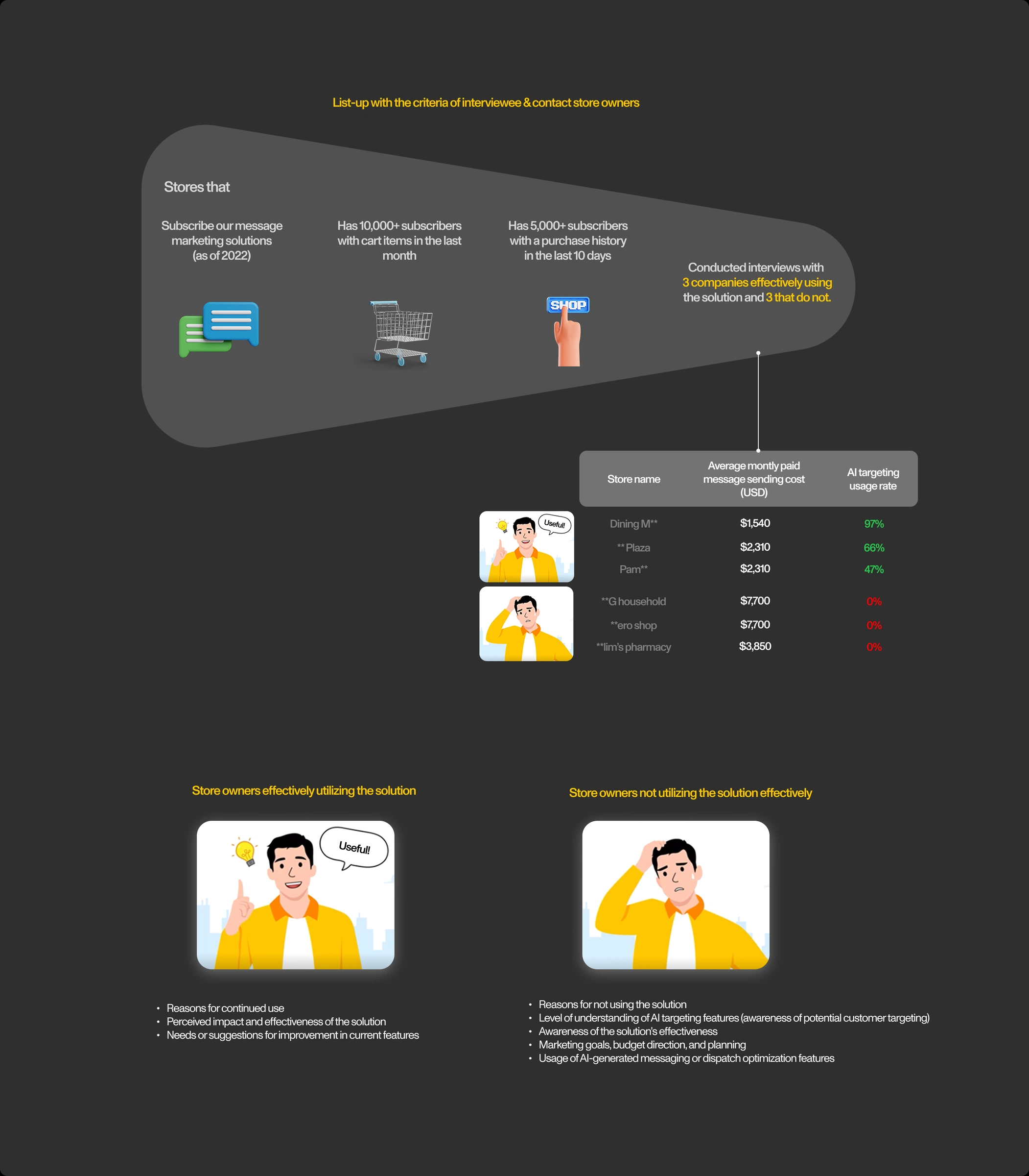
Stores were listed up by subscription and activity criteria, then interviewed in two groups, effective users versus high-spending non-users, with question tracks tailored to each.
I worked bottom-up: first listing every input the dashboard could draw on (user data, behavior logs, message history), then grouping it by AI feature, and finally defining the metric each feature should be judged by, the expected impact a store owner would actually care about.
Team feedback reshaped the map before any UI existed:
That map became the baseline I used to communicate with product and engineering while the detailed visualizations were still evolving.
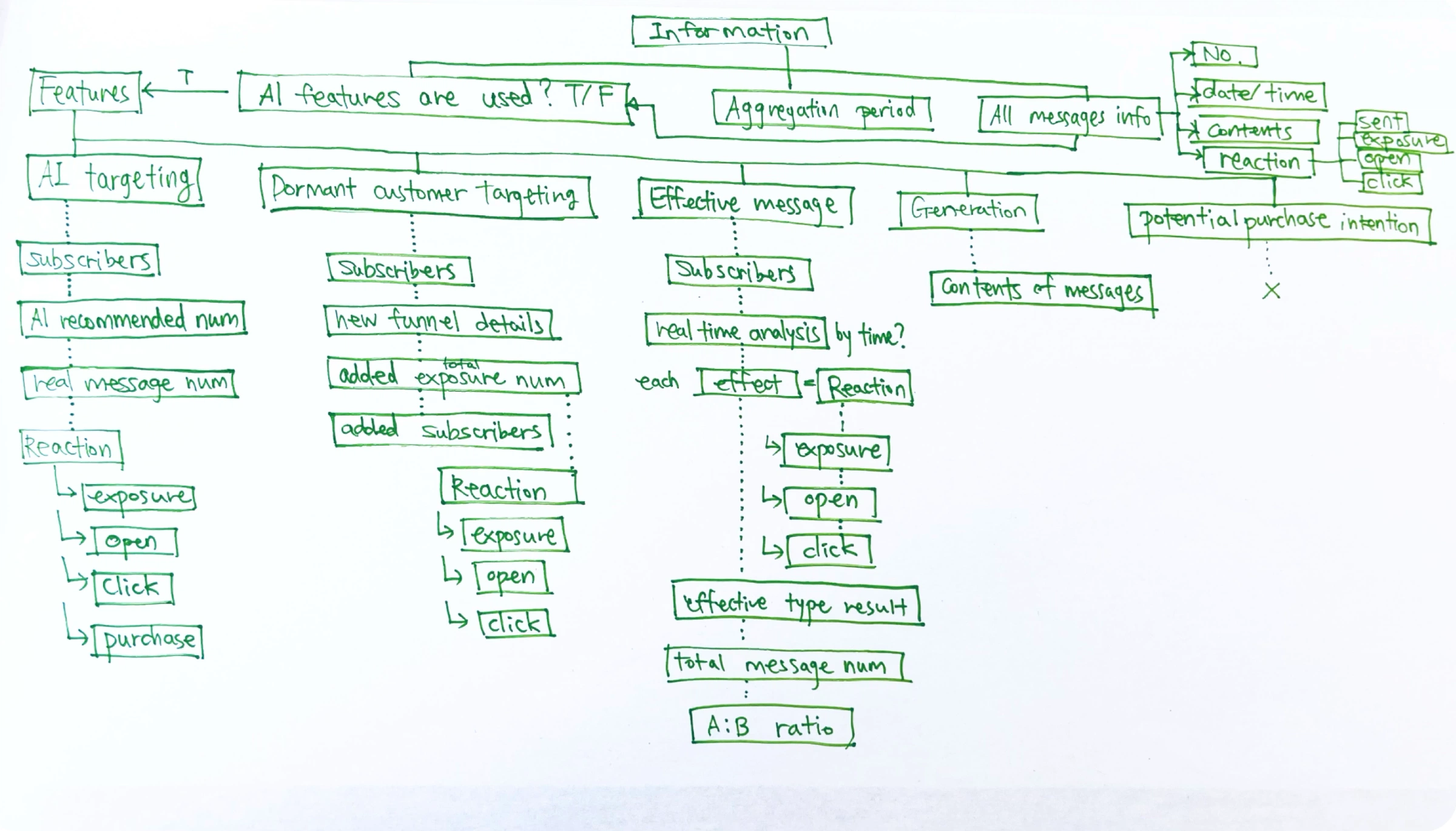
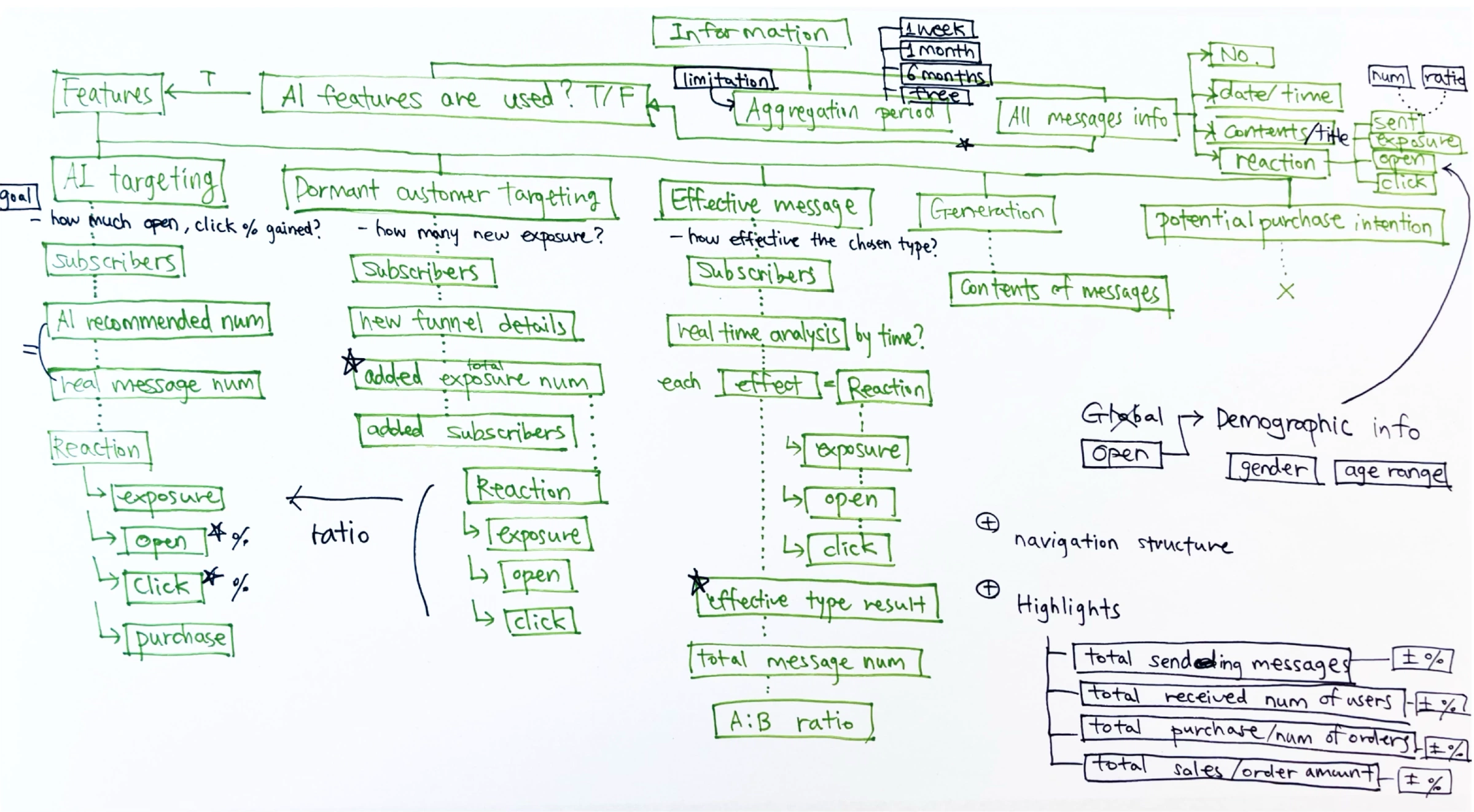
Every available input, grouped under the five AI features with the reactions (exposure, open, click, purchase) each one produces. Click the arrows to see how the map changed after team feedback.
Give users enough context to understand overall performance without forcing analysis.
Lead with the signals most connected to business decisions rather than the metrics easiest to calculate.
Make deeper detail useful by connecting it to a next step.
The structure was designed to absorb feature-specific data without requiring a different dashboard architecture for every new metric.
Visualization was a decision tool, not decoration. I compared graph forms based on whether users needed to understand trend, magnitude, comparison, or contribution, and I worked through emphasis and hierarchy so the most important information did not disappear into equal-weight cards.
The rejected graph directions are part of the design story because they show how different visual forms answered different questions, and why the final hierarchy became simpler.
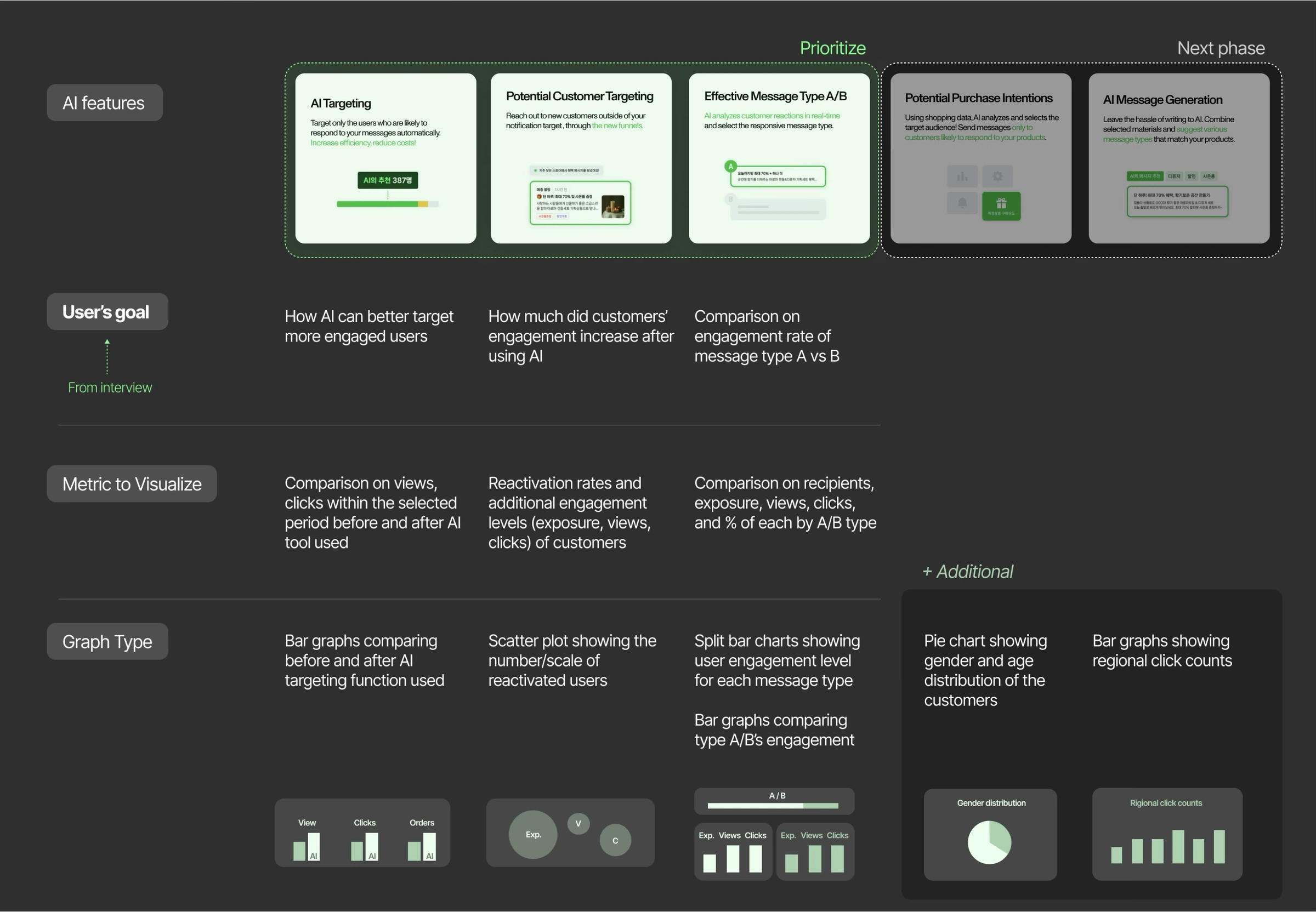
Each prioritized AI feature was mapped from the interview-derived user goal, to the metric that answers it, to the graph form that fits: comparison bars for AI targeting, a scatter of reactivated users, split bars for A/B.
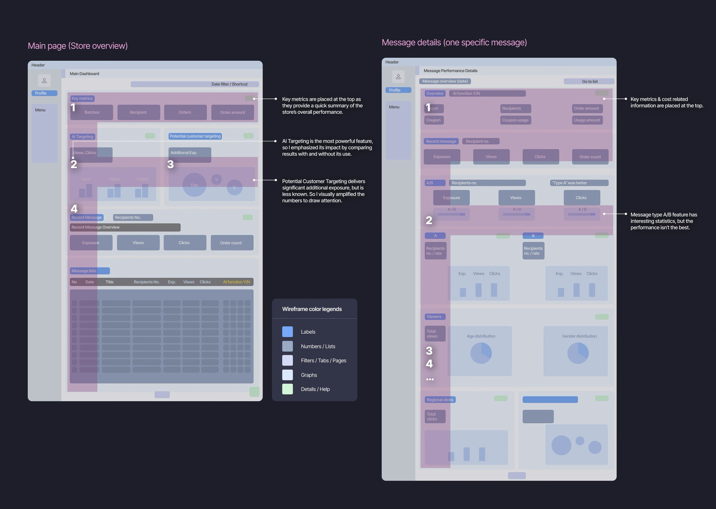
Key metrics lead both pages; AI Targeting’s impact is emphasized through with/without comparison, and Potential Customer Targeting’s numbers are visually amplified because the feature is less known.
The dashboard was delivered on the CLOVA Commerce Solution component library, buttons, tags, inputs, tooltips, and chart color scales, with a fixed-plus-fluid layout spec so engineering could implement the two-column grid without guesswork.
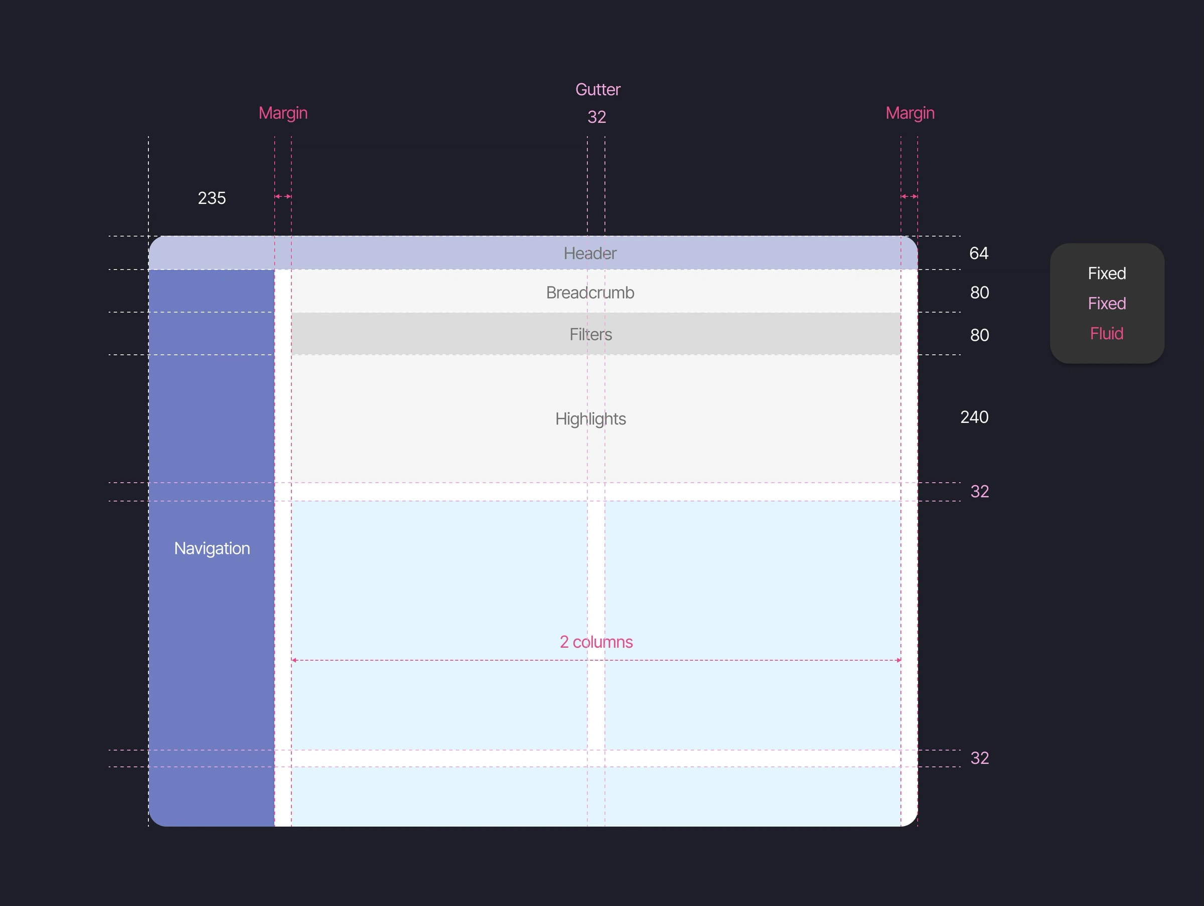
A 235px fixed navigation rail, fixed header and highlight rows, and a fluid 2-column content grid with 32px gutters.
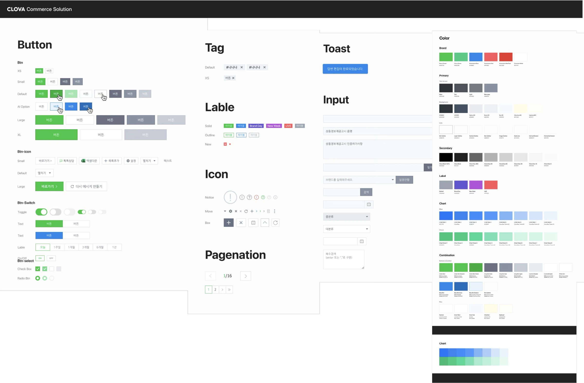
Buttons, tags, labels, icons, inputs, pagination, toasts, and the brand + chart color scales used across the dashboard.
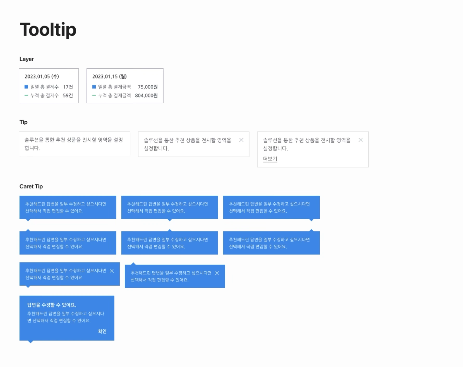
Layer, tip, and caret-tip variants, the building blocks for the criteria explanations that mattered after launch.
I translated the information strategy into a dashboard that supported both scanning and deeper investigation. The visual hierarchy emphasized the most important outcomes first, while secondary details remained available without overwhelming the initial read.
Sensitive customer values are anonymized without changing the underlying structure.
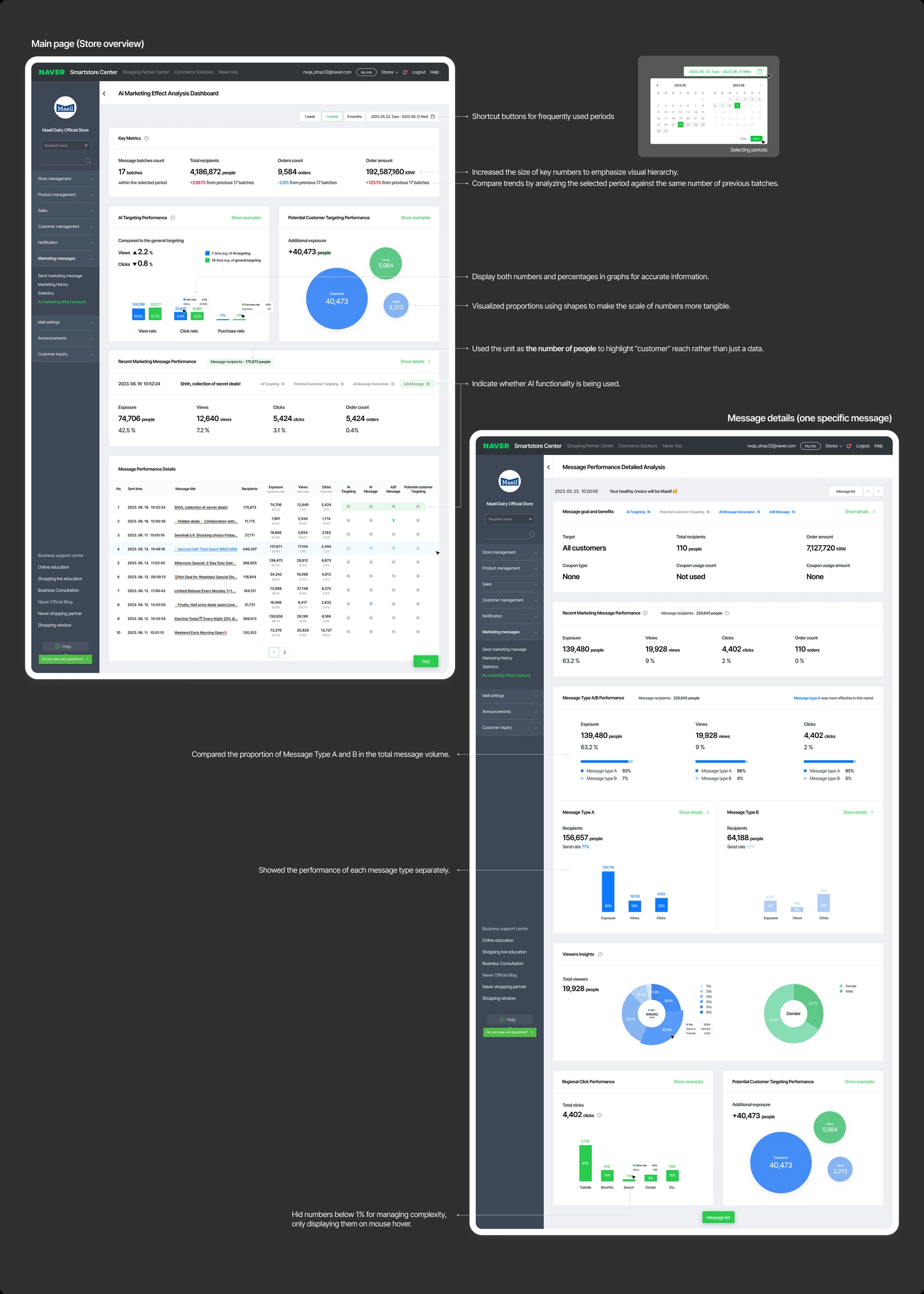
Period shortcuts, enlarged key numbers, trend comparison, numbers and percentages together, proportion shapes, people as the unit, AI-usage indicators, per-message A/B analysis, and sub-1% values hidden until hover.
When a store hadn’t used a feature during the selected period, the module doesn’t go blank, it shows what comparable stores gained and offers a one-click way to enable the feature.
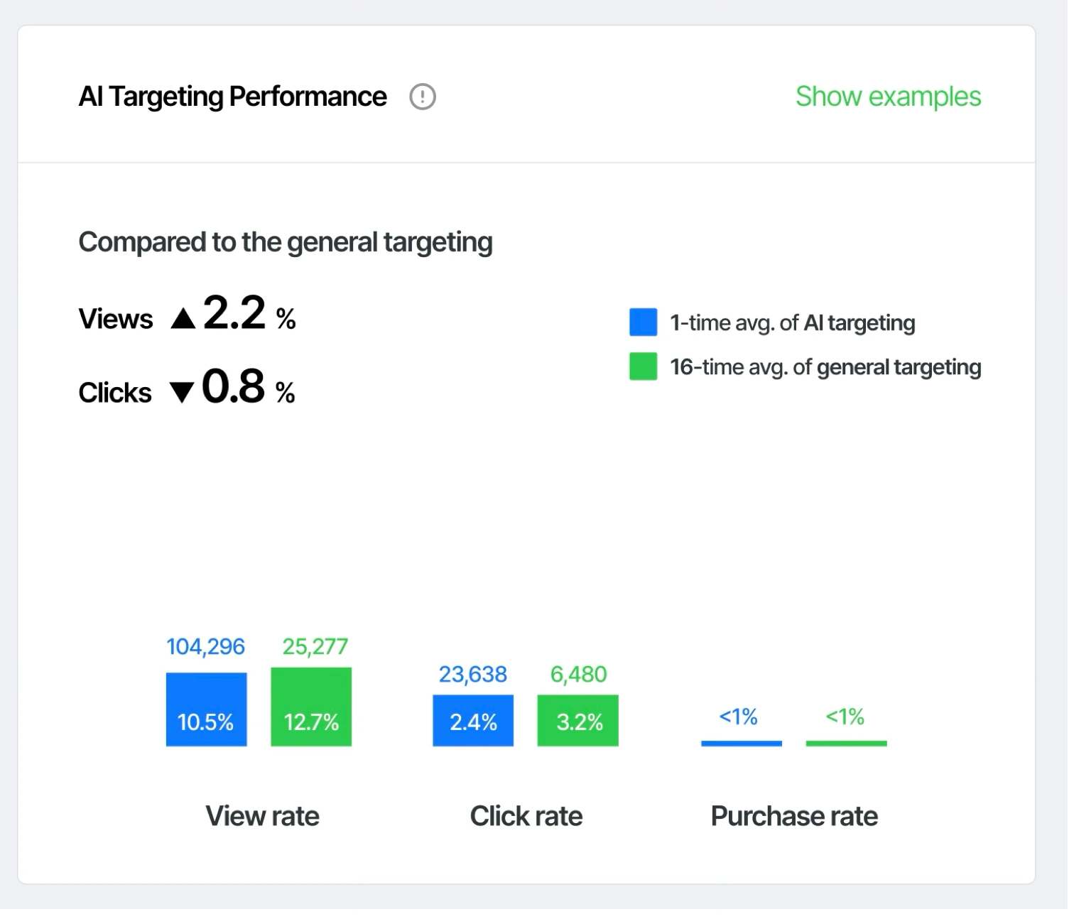
With data available, the module compares AI targeting against general targeting with both numbers and rates.
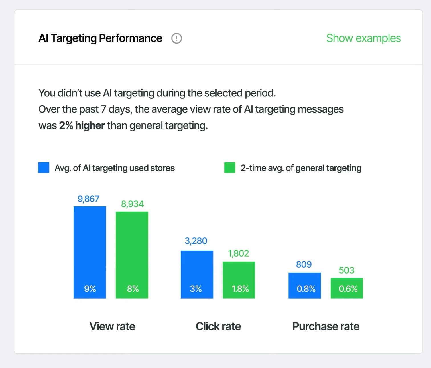
Instead of an empty card, the store is benchmarked against averages of stores that did use AI targeting.
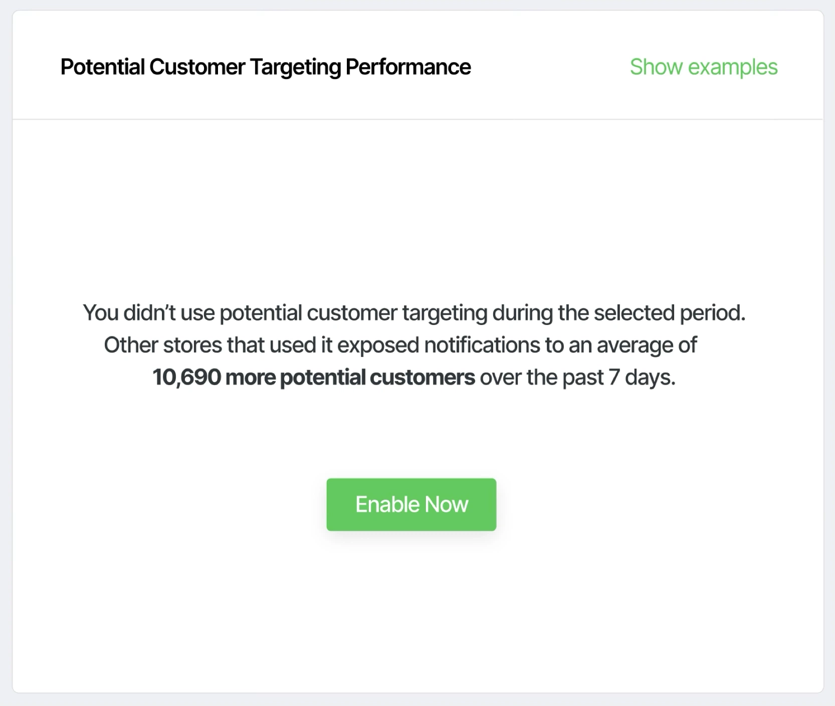
“You didn’t use potential customer targeting” becomes a pitch: average additional reach of other stores, plus an Enable Now action.
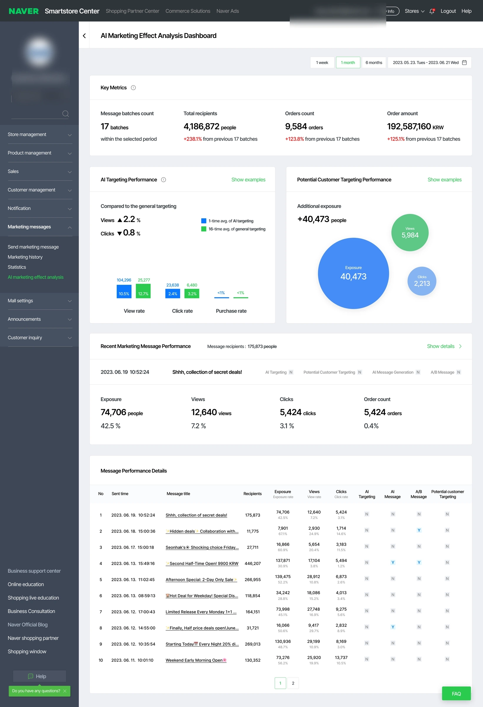
The complete main dashboard page.
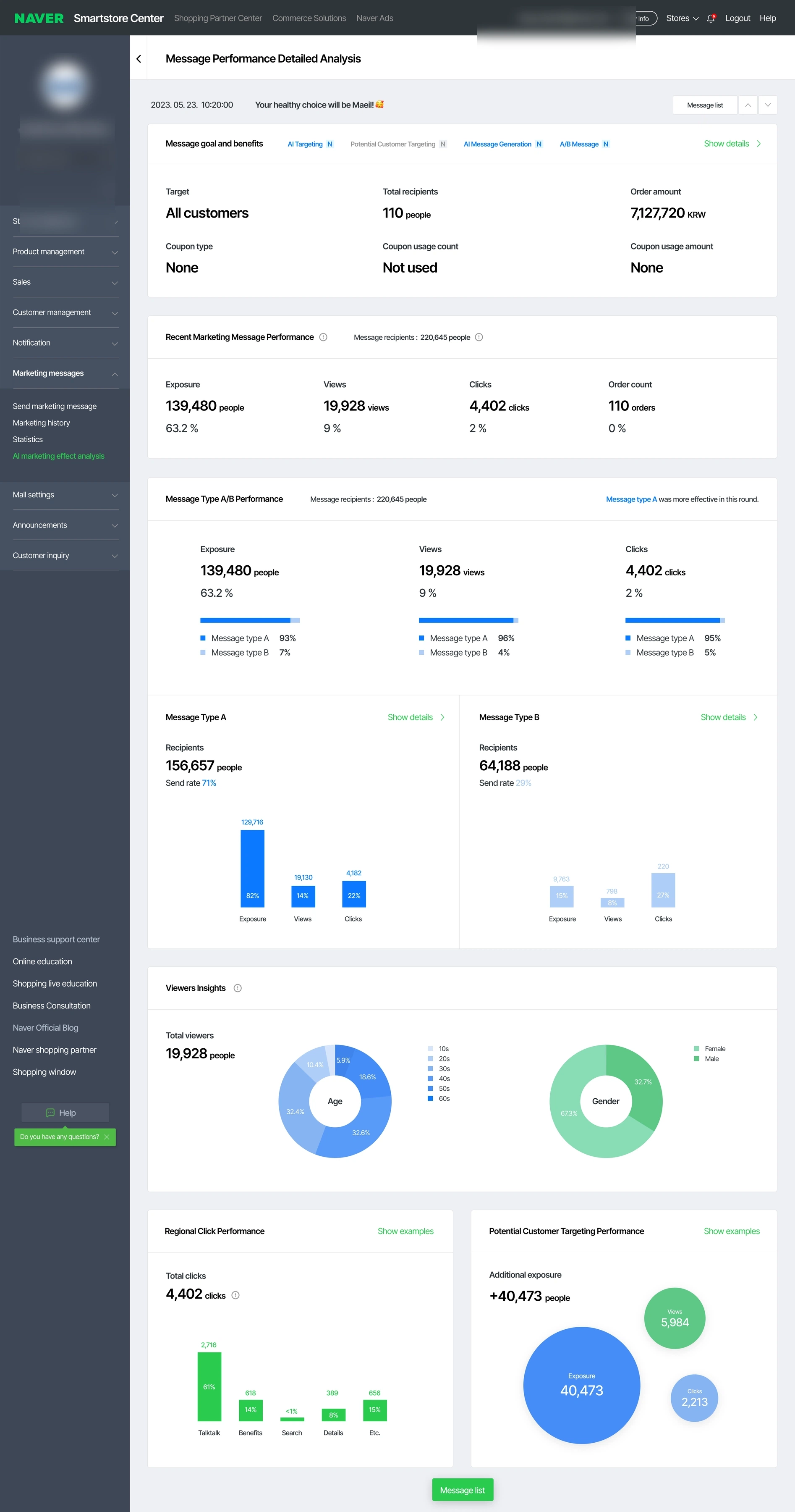
The complete per-message analysis page.
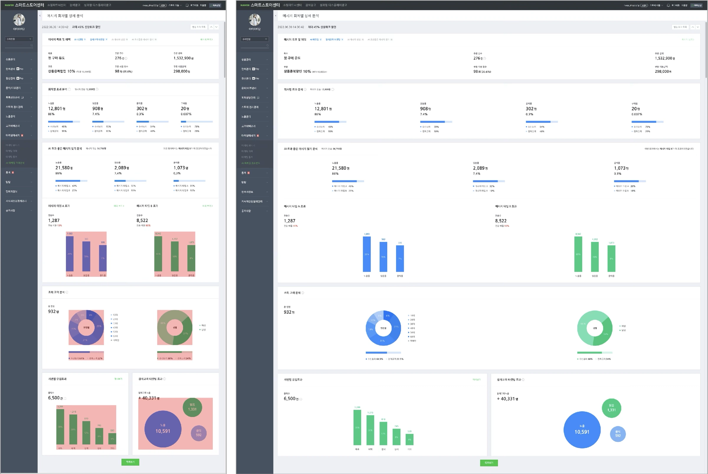
The shipped Korean UI adapts the same information hierarchy across narrow and wide viewports.
After launch, end-user feedback split into satisfaction (demographic data), suggestions (cost savings, Excel export, category benchmarks), and frustration: users kept asking about aggregation criteria and didn’t fully understand the new features.
So the question became: how might we improve onboarding and minimize confusion? I answered it inside and outside the product, criteria tooltips and one-time entry-point guidance in the UI, anticipated questions added to the FAQ, feature education shared via Keynote, and this walkthrough video.
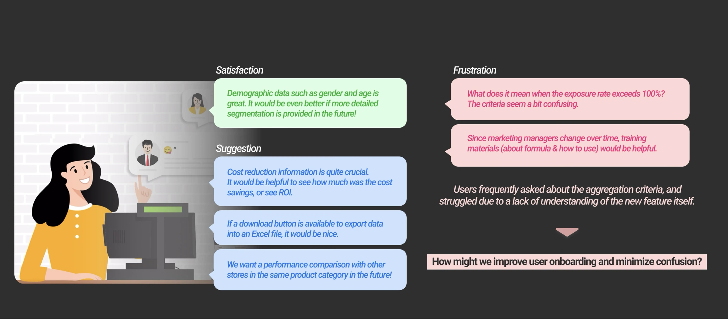
Satisfaction, suggestions, and frustrations: recurring confusion about aggregation criteria and the new features themselves led to a set of improvements.
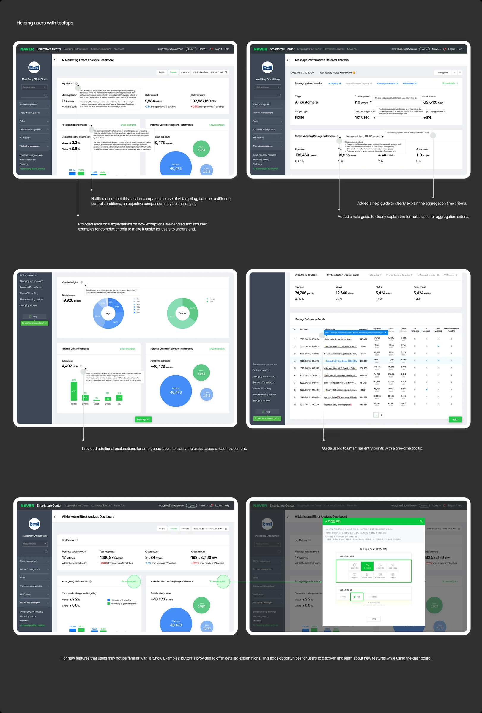
Six changes for the parts users found hard to understand: criteria and formula explanations where questions arise, clarified labels, a one-time tooltip for the unfamiliar entry point, and “Show examples” walkthroughs for each new feature.
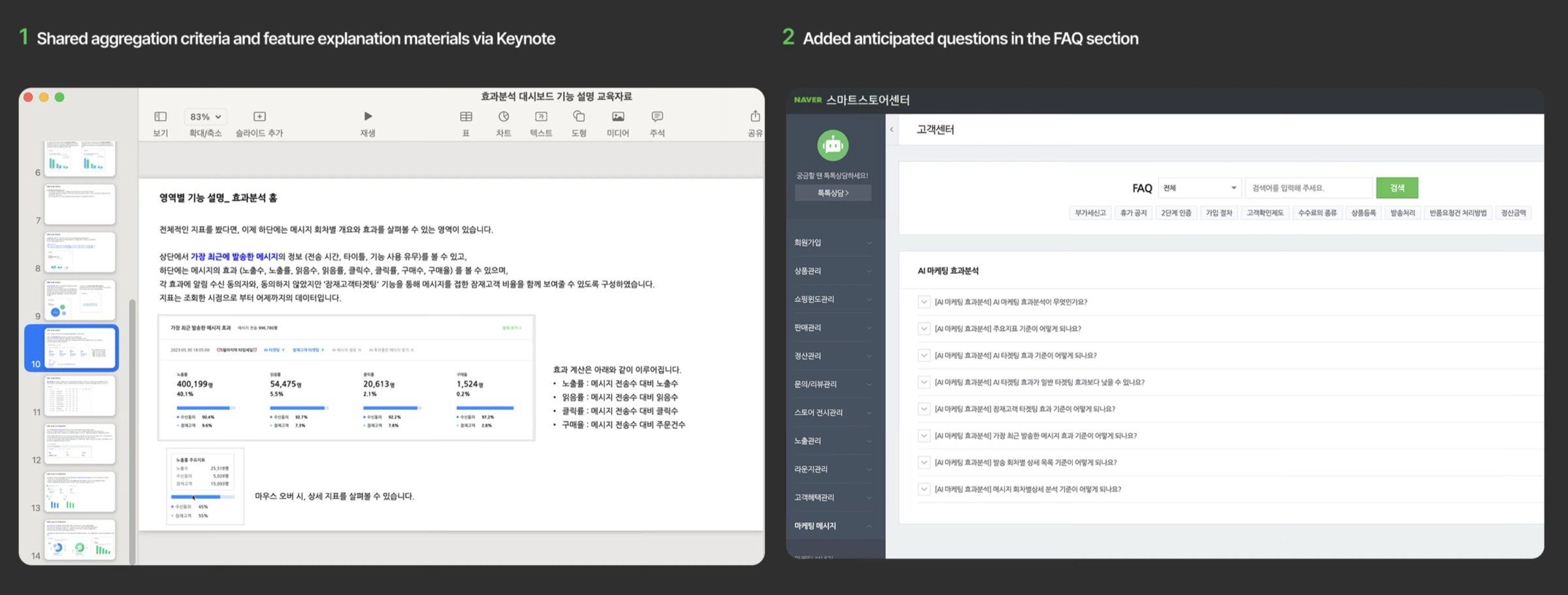
Aggregation criteria and feature explanations shared via Keynote, and anticipated questions added to the help center FAQ, the same content the video below walks through.
The education content as a video guide, helping customers interpret each module in their marketing workflow. Originally in Korean, subtitled in English.
Subscriptions were maintained and grew: stores subscribed to the solution rose from 36,000+ to 37,000+ within a month of launch, against an end-of-year goal of 50,000+. Just as importantly, the work built a strong connection with enterprise users.
Designing with users: engagement, clarity, and continuous improvement.
Interviews set the priorities, team feedback reshaped the information map, and post-launch questions drove the education work. Users were part of every phase.
For a new and unfamiliar feature, the deliverable is not only screens. Education, FAQ, and in-product guidance are what turn a shipped dashboard into an adopted one.
Keep refining with real usage data and recurring customer questions, starting with how to present cost-saving data, the concern users raised most.
In 2025 I revisited the project as a quick design challenge for the agent era. The shipped product was AI-powered: AI reported message performance, and users could only view and interpret the dashboard. The rethink turns it into an AI-native “Smart Campaign Advisor” that proposes strategy and lets users adjust.
Visualizes the performance of messages. Users only read the dashboard (passive consumption) and interpret the displayed results.
AI proactively recommends and executes strategies based on outcomes; users train the AI through feedback.
Centralized where agent roles are fixed and repeatable and observability matters (analysis, strategy); decentralized where rapid response matters more than governance, teams are divided functionally, and sensitive data is limited (tone, scheduling, execution, learning).
A chain of responsibility, with a mesh adjustment between the tone and schedule agents.
Non-expert users describe the campaign goal in one sentence. Clova’s Review parses the intent into goal, target, period, and channel as an editable, semi-structured plan, so users never face a blank configuration form.
Consideration 2: balancing user authority and automation. The answer is constrained configurability: delegation and configuration are the two levels our target users live in, with full creation reserved for power users.
For repetitive, predictable tasks: describe the goal in a sentence and the agent chain is assembled, with target, period, and channel auto-detected.
Semi-expert users modify the agent sequence, rules, and conditions inside the guided flow. Each recommended agent carries its measured impact (+17% open rate from timing, +57% from segmentation), so adding one stays an evidence-based choice.
Opening an agent shows what it does and the measured impact behind the recommendation, so adding or removing one stays an evidence-based choice, the same principle as the original dashboard.
A node-based canvas with AI Agent, Condition, Action, and End nodes, reserved for power users and internal teams.