Live interaction · Audience experience
KISWE MOBILE · HANGTIME · 2019
Giving a fandom a way to act together,
and a mark to recognise it by
A concept study built on research I ran during my first design internship: 200,000 fans watching the same concert alone in their rooms, told the number but given no way to feel a single one of them.
 LIVE
LIVE
Concept visual. The live layer sits on top of the broadcast, never in place of it.
Everyone was there. Nobody could feel it.
A counter banner said 200,000. There was no crowd, no lightsticks, no sign of another human being. The number was information, not presence.
I watched a full concert and logged where the product held attention, and where it broke it.
I watched it as a fan, not as a competitor audit, and wrote down every moment the product lost me.
Fans wanted to react between songs, not during them.
Choice was nice. Using it interrupted the flow.
A hang should switch like a channel, not a door.
The finding that redefined the brief.
Concert energy is a crowd effect, not a video quality problem.
One test for every feature after that: does it let fans feel each other in real time, without pulling their eyes off the stage?
- A fan can do it with one thumb, without reading.
- The crowd shows up as one shared signal, not 200,000 separate messages.
- Nothing pauses, covers or reloads the stream.
Five features that sit on top of the stream, never in front of it.
{{ featTitle }}
{{ featDesc }}
Two of the features, live on this page.
{{ topCity }}
Tap the lightstick in the bottom-right corner. Your city gets brighter on the wall behind the stage.
Protect the performance, then let the crowd rise into it.
These principles came from watching one concert closely, not from adding features to a screen. They are the part of this project I have used in every live or real-time product since.
Live UI should step back during high-focus moments rather than compete with the performer.
Use reactions, shared signals, or audience perspective to make remote presence perceptible.
Changing chat, hang, camera, or social layer should never interrupt the stream.
Participation has moments: chorus, pause, encore, transition. It should not be permanently on.
Do fans act, not just watch? One live action per fan per song, still happening after thirty minutes.
How long do they stay? Drop-off at the sixty minute mark, where the eye fatigue showed up.
Do they come back? Tickets bought for the next tour date, photocards shared the day after.
Three signals, each tied back to a finding from the concert log rather than to engagement in general.
The other half of the internship: Hangtime's rebrand.
Hangtime was moving from chat-centered social video to interactive live video, and the app icon no longer said what the product was. I owned the icon renewal end to end, from the brand research it started with to the mark the team chose.
I started from language, not shapes. Everything the team said about the product went onto sticky notes and got grouped until nine clusters held: media based, real-time changeable, exciting feelings freely, lively, interactive dynamic, group together, three-dimensional, dynamic. Those clusters collapsed into three brand characteristics under one core value, Better Together, and each characteristic was then translated into something drawable: Changeable into flexible, Interactive-Together into a connected circle, Playful-Young into vivid motif. The motif I proposed came out of the name itself, a person with open arms, which is also the lowercase h.
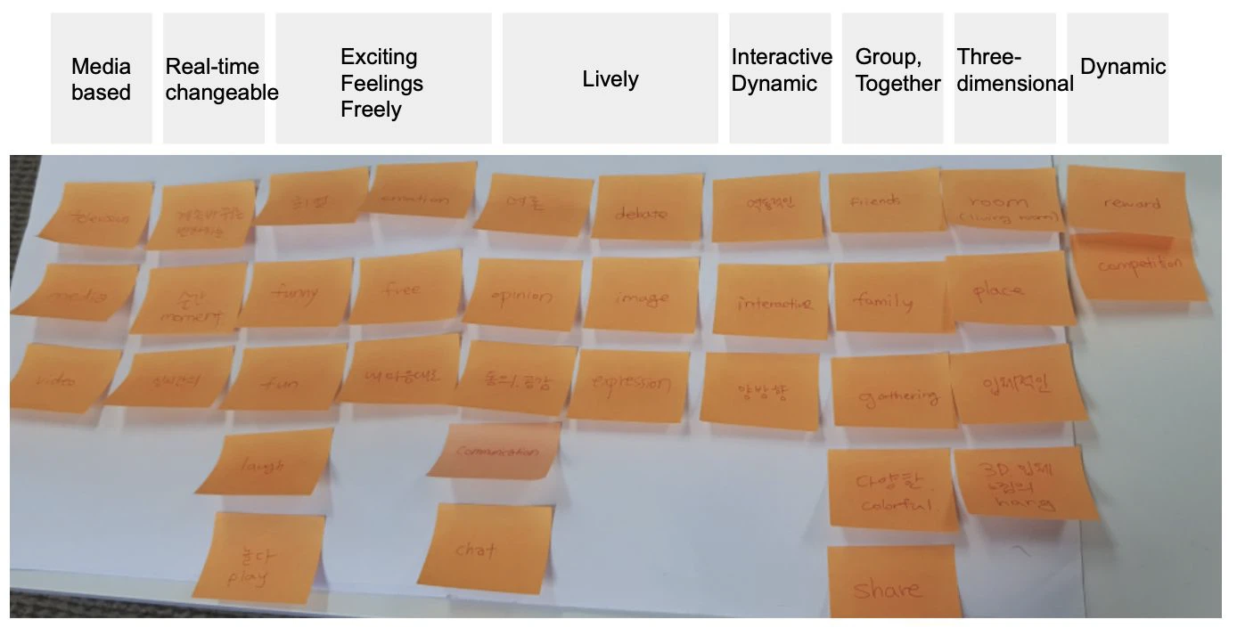
What Hangtime is for, and the thing every mark after this had to carry.
Real-time media capture of a moment. Conversations and images pass by fast, so the brand has to feel like it is changing.
Interactive communication between media and users, small groups gathering to share what they feel.
18–24 sports fans as the core audience: they communicate actively, compete, and say what they think without hedging.
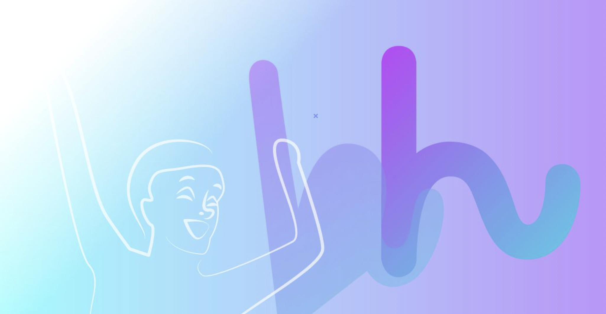
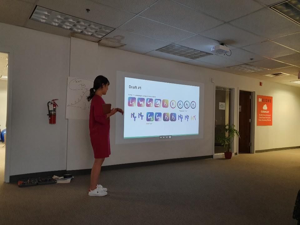
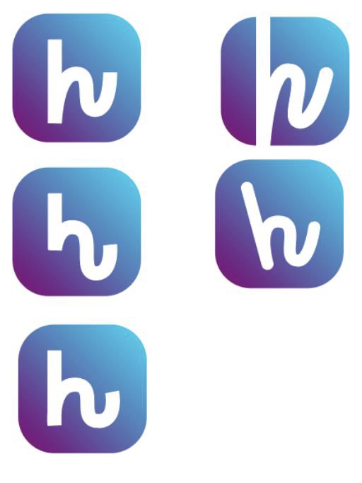
I designed on instinct, no criteria: forms I found interesting. The team liked the craft and said the same thing three different ways, that it looked like a messaging app. Nothing here said live video.
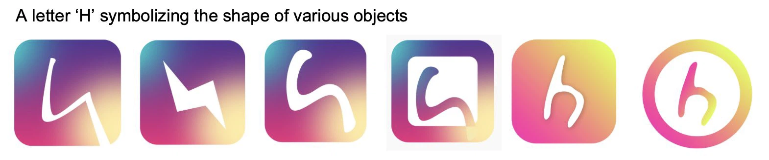
Adam set the brand palette, so I stopped choosing colors and started choosing meanings: a party popper for the moment a song drops, a crowd behind a play button, an H built from a person with their arms up. The team picked four of these to test.
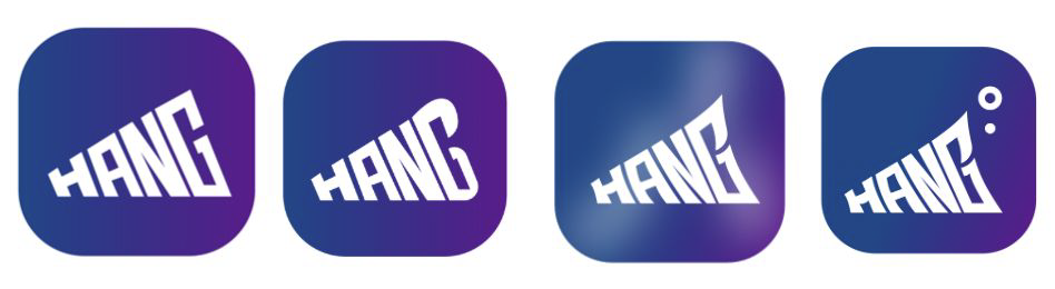

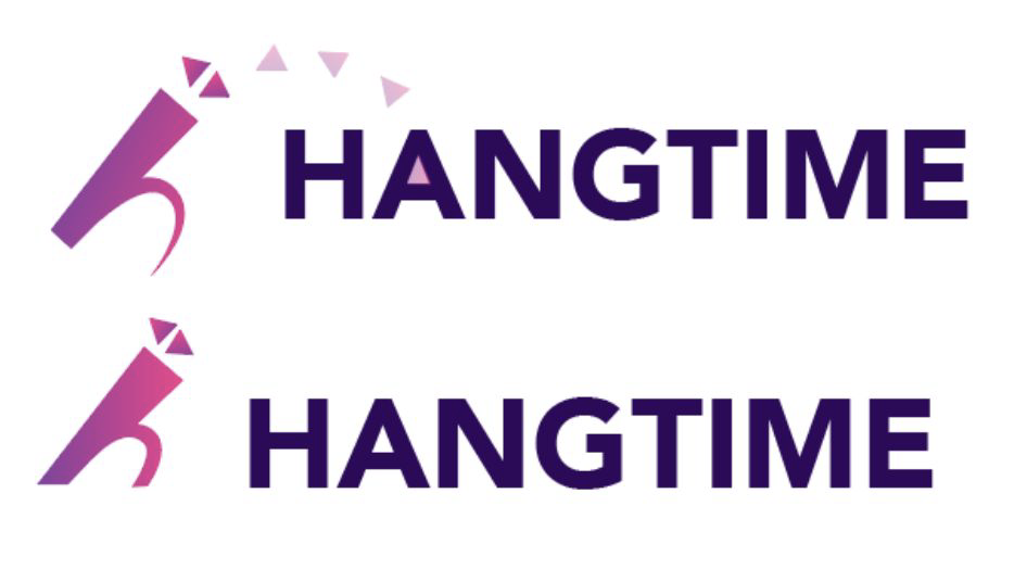
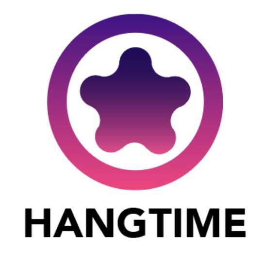
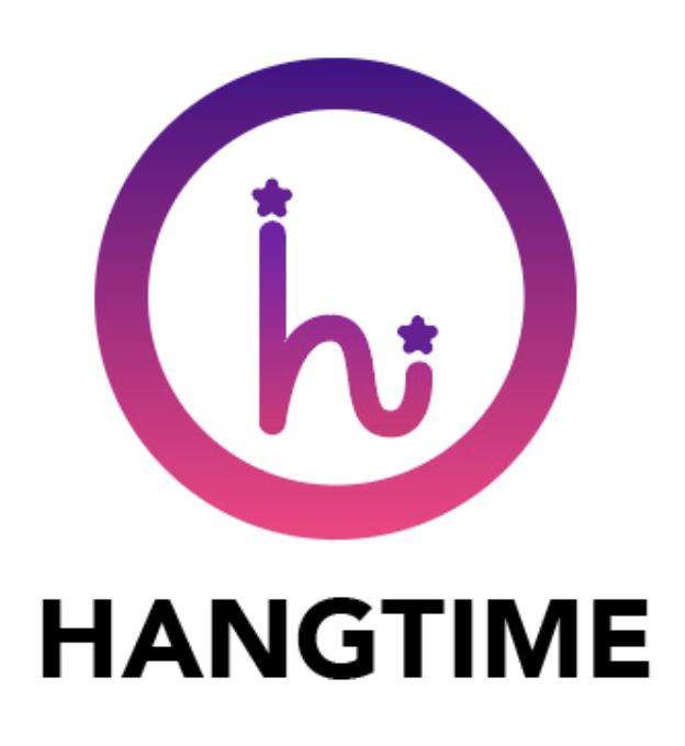
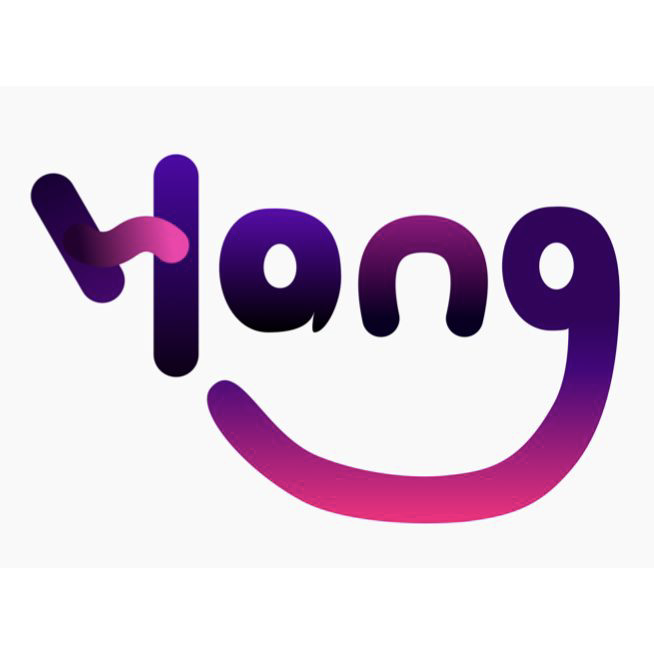
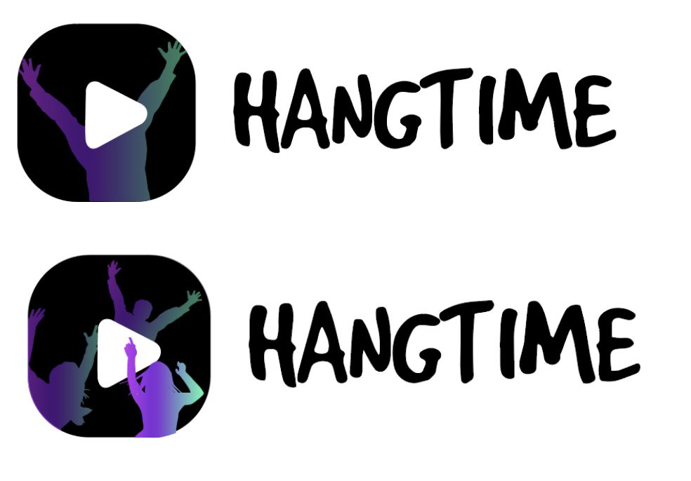
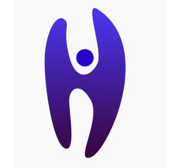

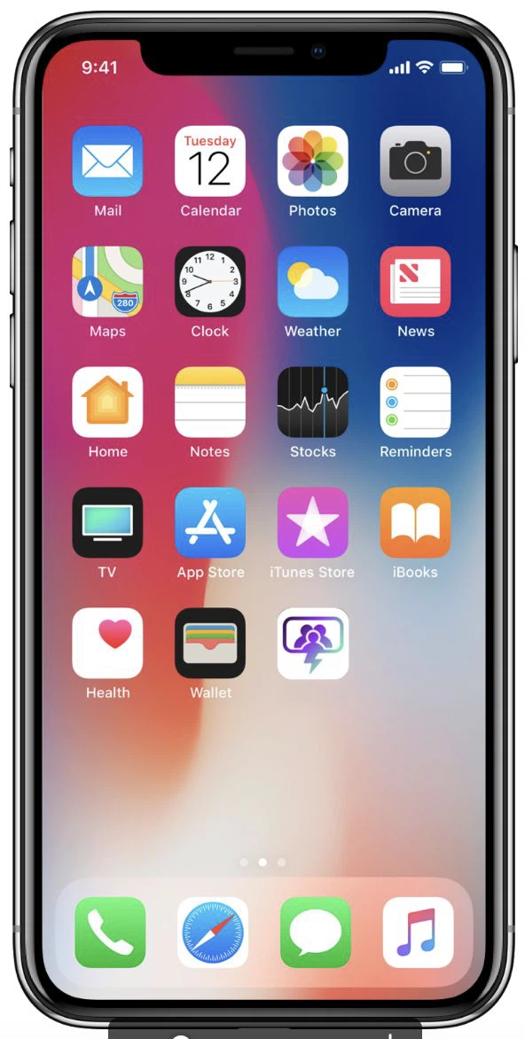
Not “which is prettiest” but whether the icon could carry the app's functionality: each option was mocked up on an iPhone home screen next to Mail, Photos and TV, then asked two questions. “What do you like the most?” and “What do you think this app is for?”
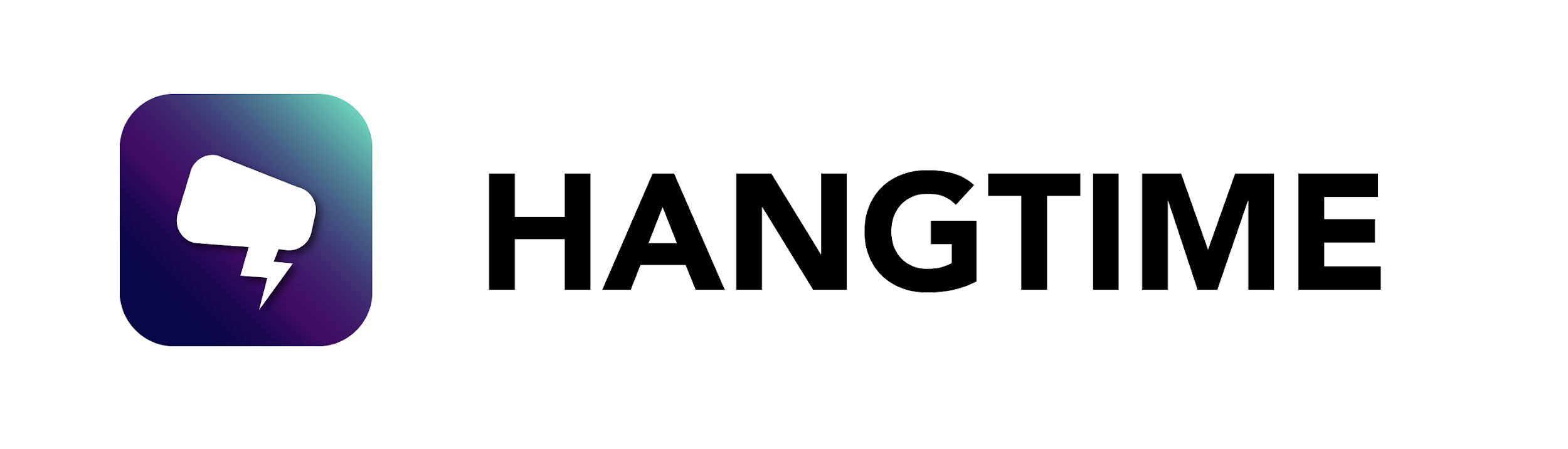
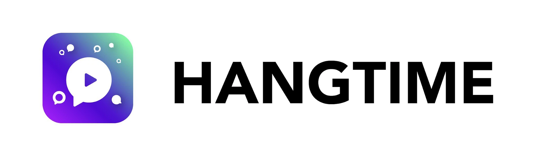
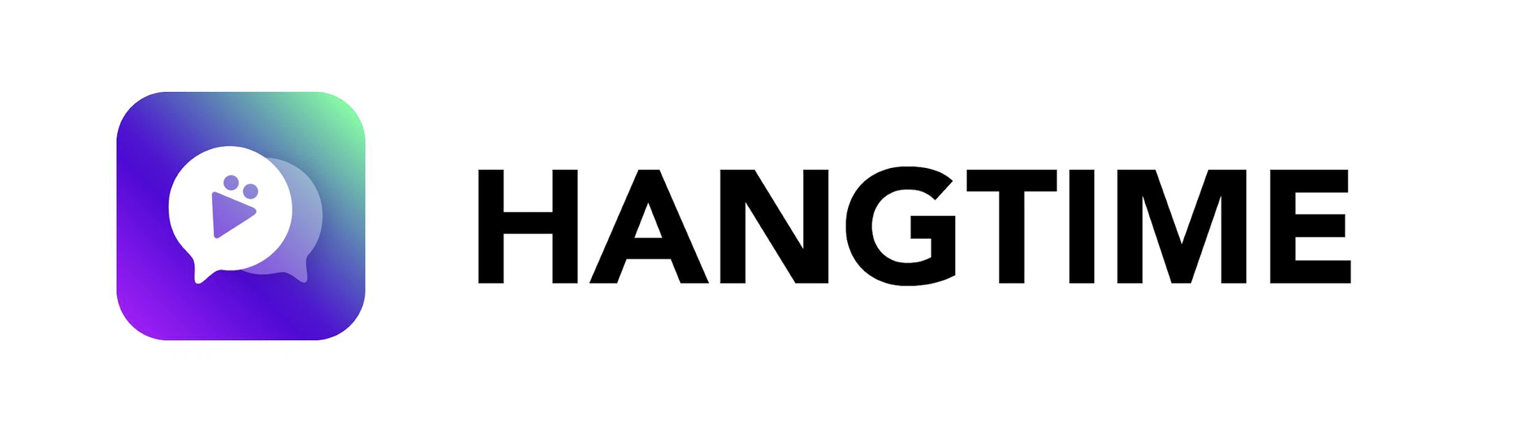
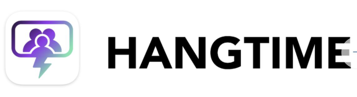
The results were clean and I still could not act on them. So instead of starting another round I wrote to the team: one criterion is not enough. Immediate recognition is nice, but Netflix, Snapchat and Pinterest all fail that test and are read perfectly well. I asked for several criteria, more varied questions, and, since I had joined after the rebrand was decided, the goal behind it.
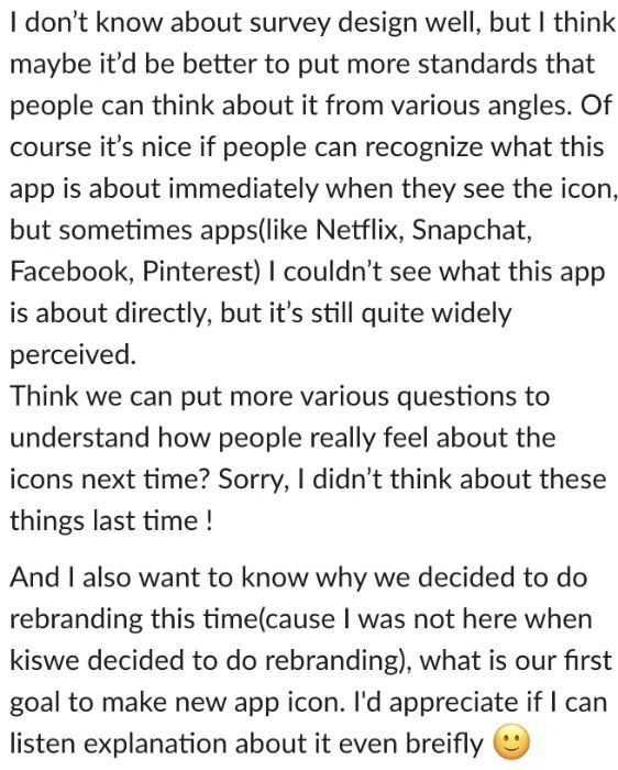
Two answers came back, and both changed the work. YouTube content was landing in Hangtime, so the value to emphasise moved from conversation to interactive video. And Mike, our CEO, set the constraint: the letter H is good, but this is a global app, so focus on the features.
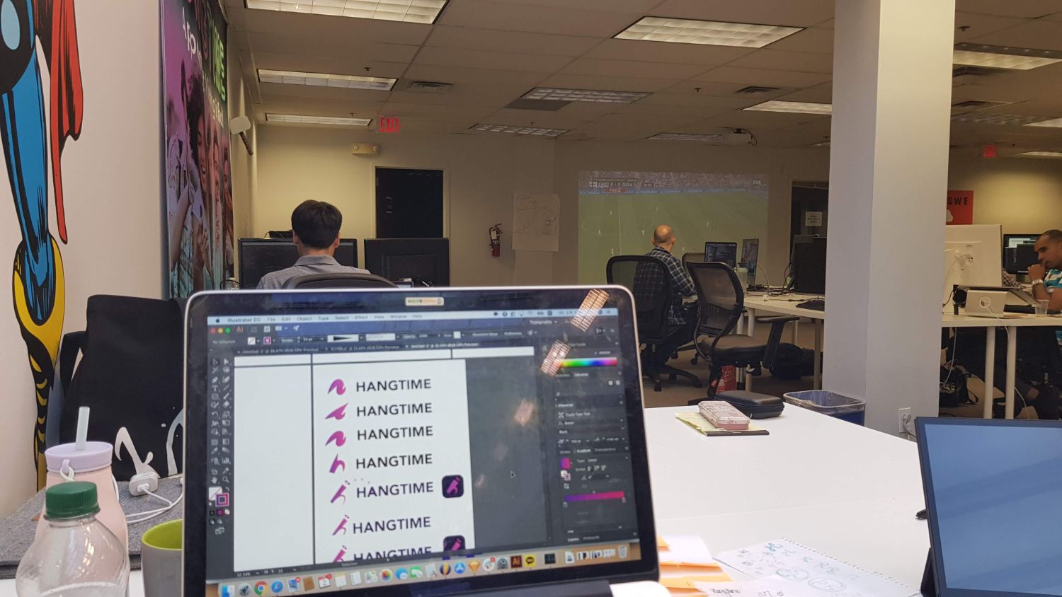
With the goal finally written down I stopped designing letters and started designing the feature: a screen with a play in it, people inside that screen, reactions coming out of it, two screens linked together for a hang. The lowercase h survived only where it doubled as one of those shapes. This is also where I started every idea as a row at real icon size, because the survey had taught me that a mark that only works at 400px is not an app icon.
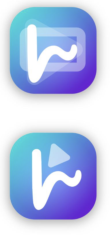
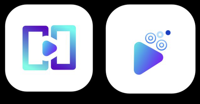
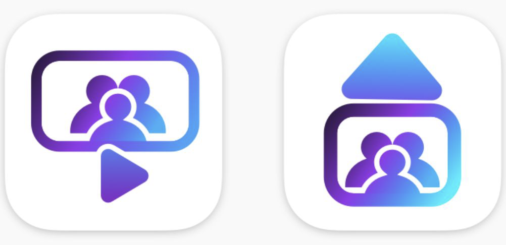
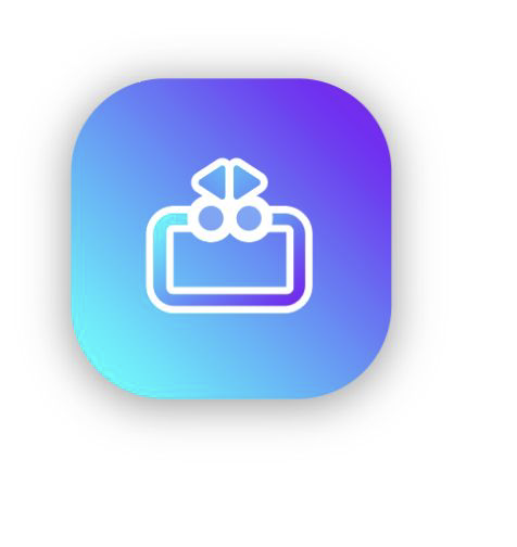
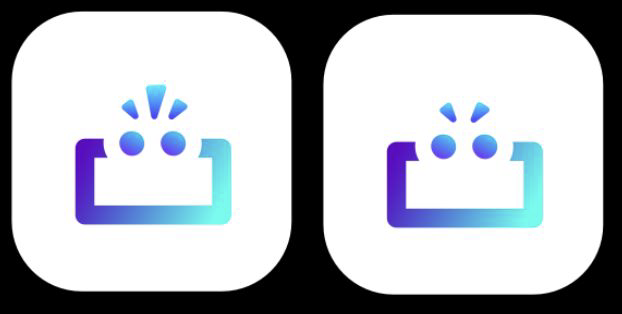
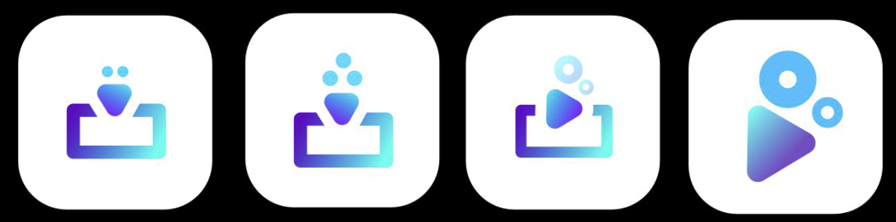
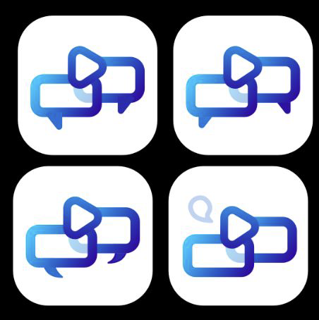
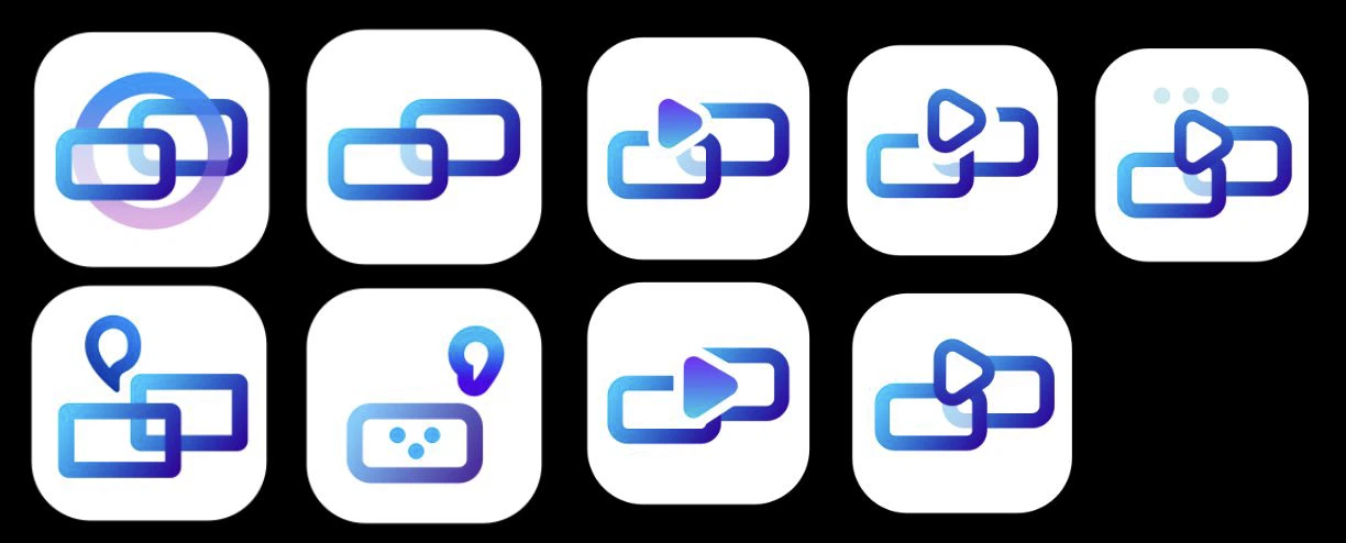

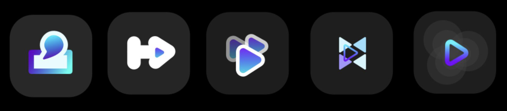
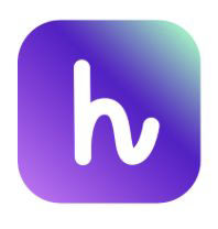
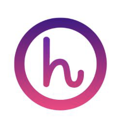
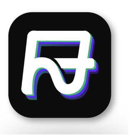
The obvious answer was to draw both halves of the product, chat and video, so the bubble-and-play family got the furthest. Mike\u2019s feedback reframed it: emphasising the letter H is fine, but this is a global app, so lean on the feature, not the initial. In parallel the reduction tests began, because the confetti, dots and bokeh versions all died at 60px on a home screen.
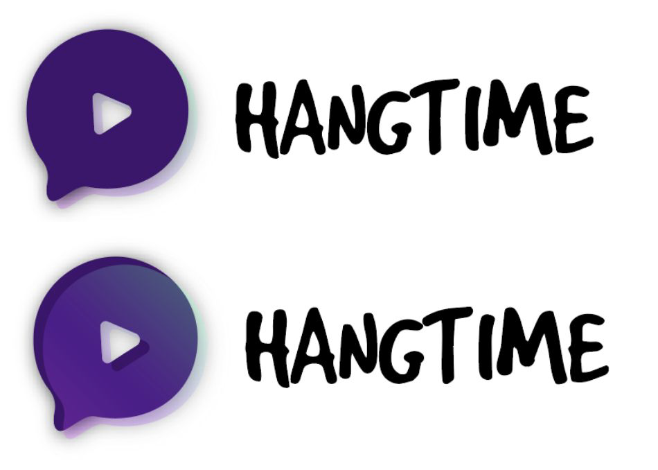
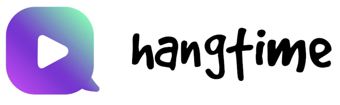
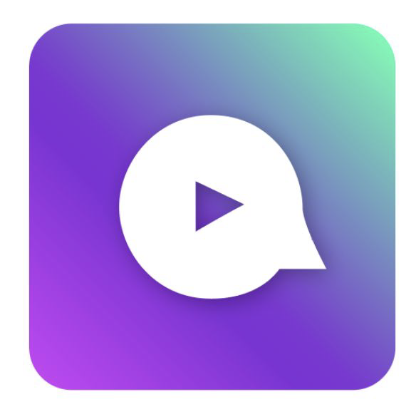
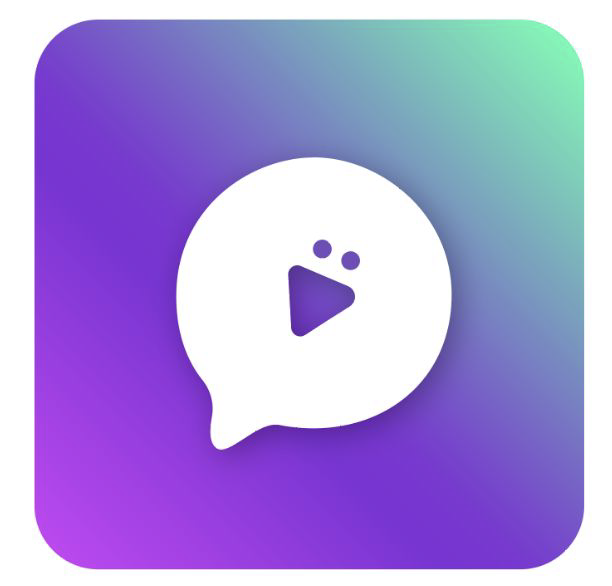
The last round split into three answers to the criteria I had proposed: does it read as interactive video, does it survive at phone scale, does it work outside Korea. The figure mark carried presence, the play-with-two-dots carried function, and the neon and mascot studies were deliberately loud so the team could see where the brand\u2019s tone limit was. It was called fresh but too experimental, which was the useful answer. What survived was the simplest one.
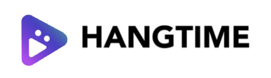
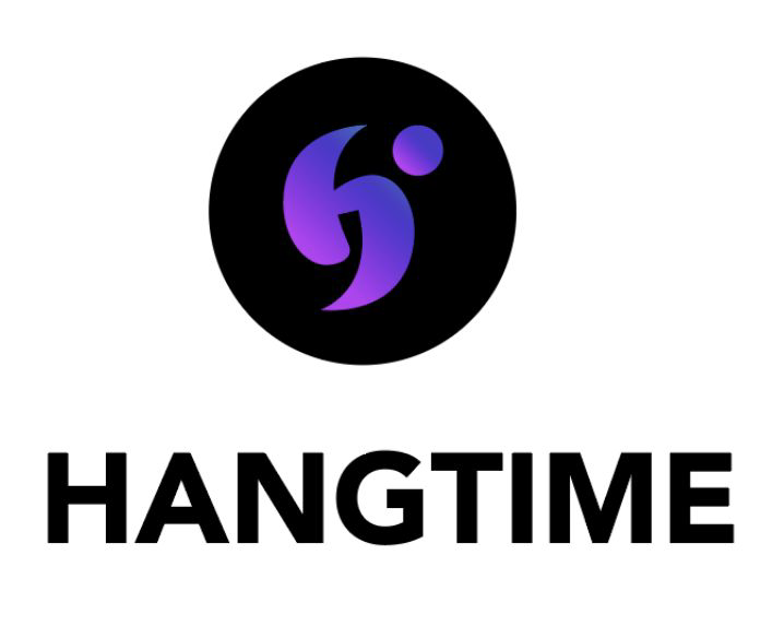
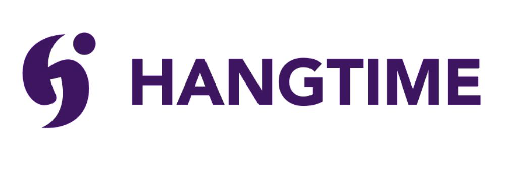
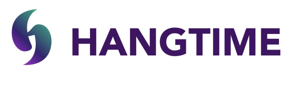
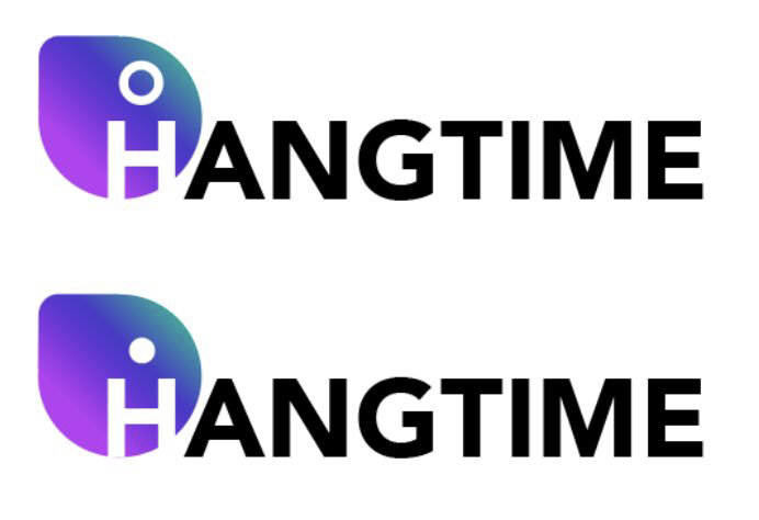
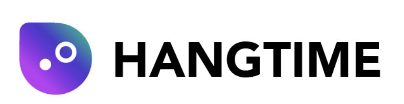
Everything I had asked for after round one went into this one: two of these four picked as the head-to-head, a wider set of questions instead of a single preference, and randomised order so position could not do the voting. The team chose the second and third options to run against each other, one leading with the letter, one leading with the feature.
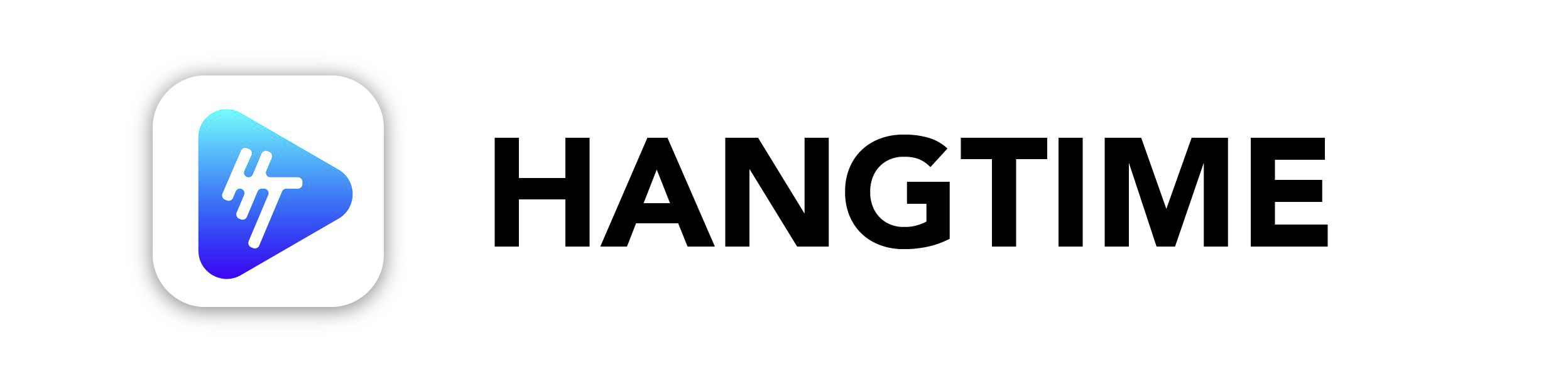
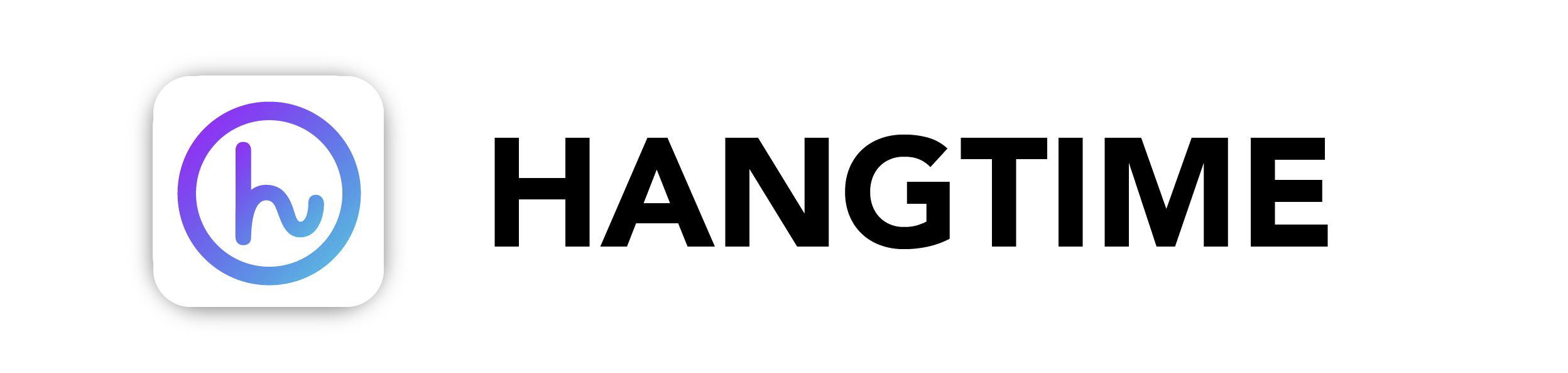
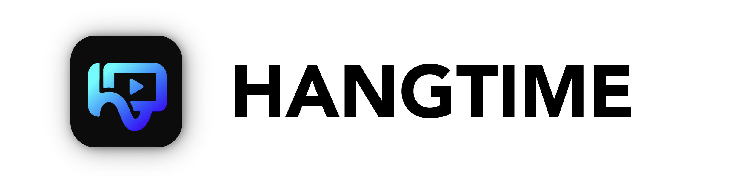
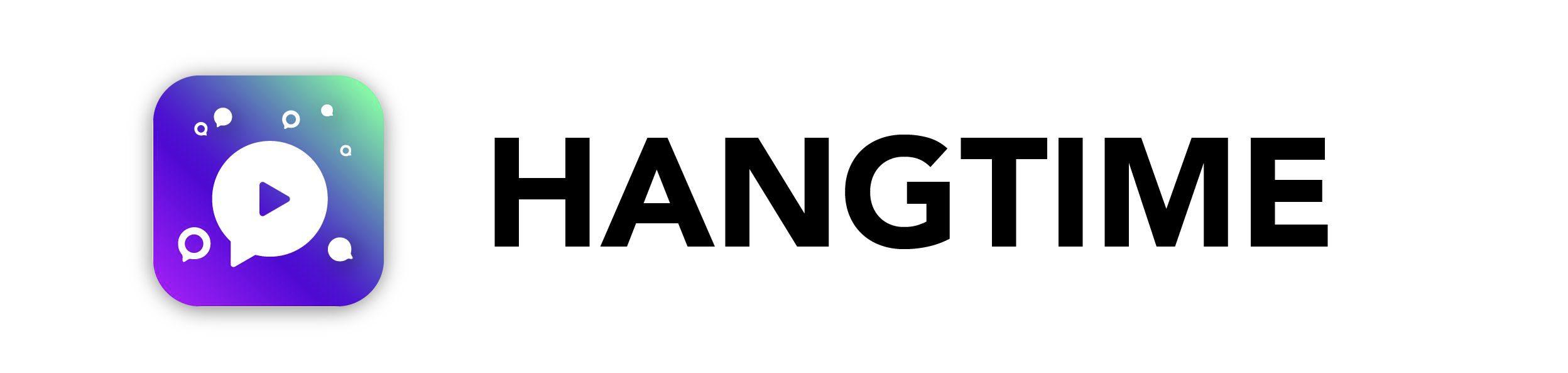
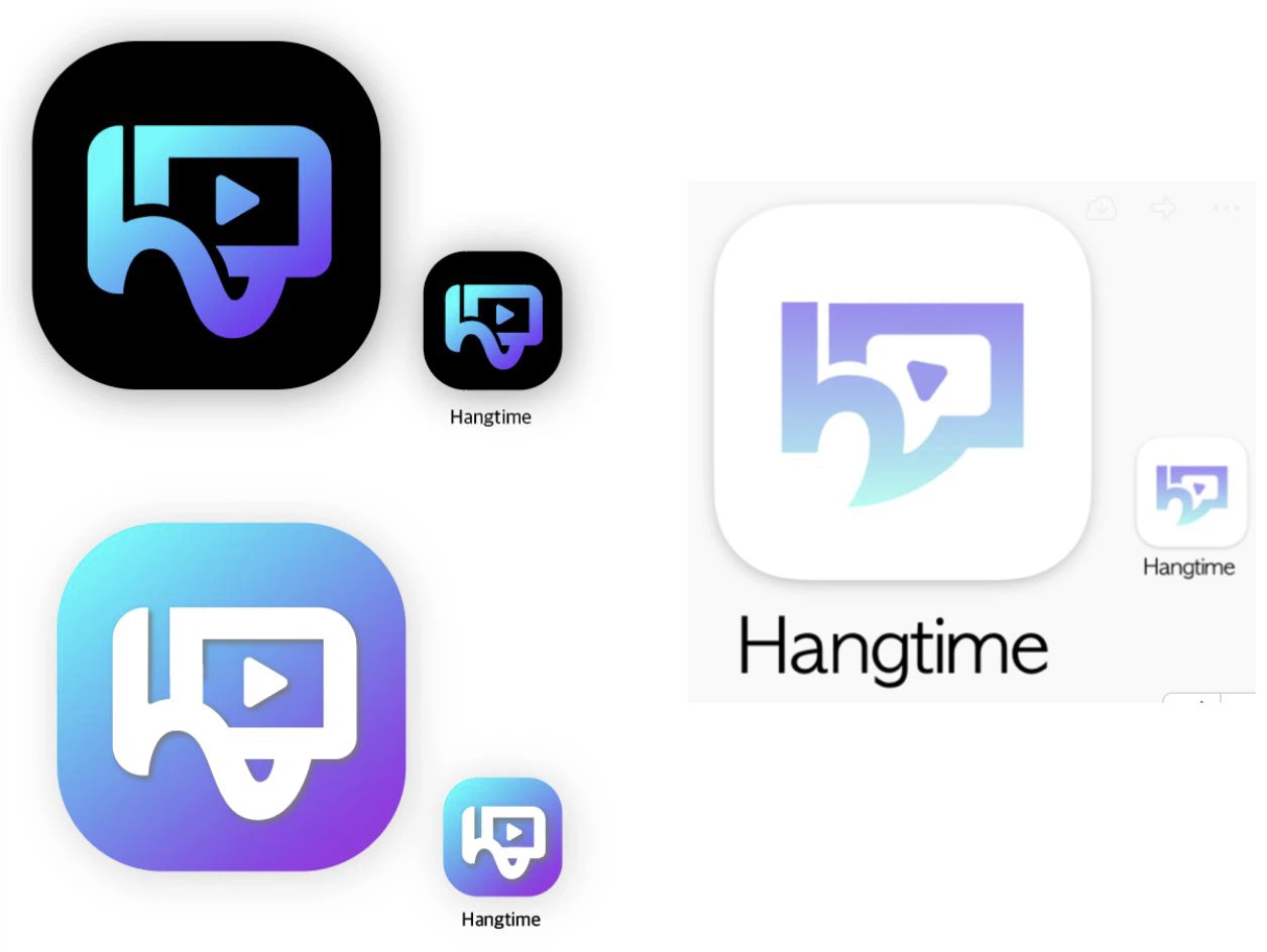
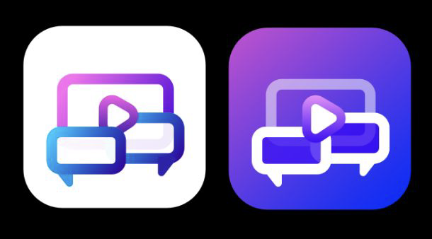
Both finalists were shown as full lockups, on light and on black, at icon size. The point of the exercise was no longer to find the prettiest mark but to see which one people could describe back to us.
The icon work is where I learned that preference data is only useful after a team agrees on the criteria.
The summer that decided where I would build the rest of my career.
My first summer working outside Korea. Inside the office I learned how a US product org argues, decides and ships, and how much of design is translating one culture for another. Outside it: museum nights in Manhattan, Brooklyn's vibe, Bell Labs in the middle of a tech boom, the freedom of Pride week, and colleagues who showed me what an ordinary American week actually looks like.
This was where I decided I would move to the States, which I did four years later.
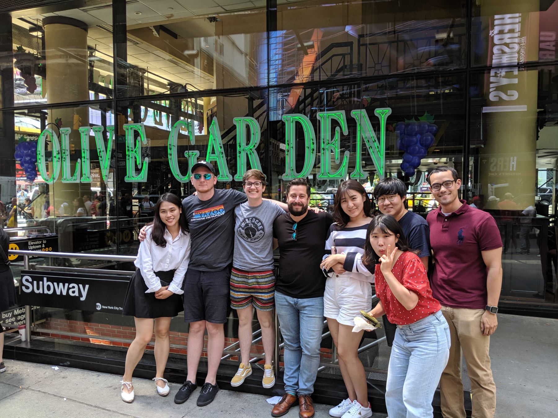
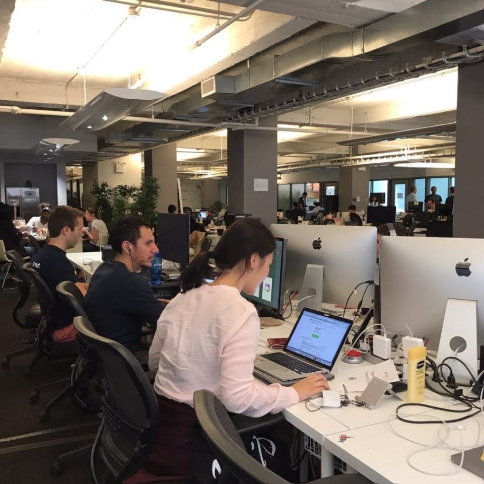
The team, midtown Manhattan, August 2019.